cane toad - an invasive species
exhibition design to discover and discuss
human influence on the ecosystem.
time frame
march - july 2022
team
agnes kloos, sosthira ravichchandran, moritz schuker
tools
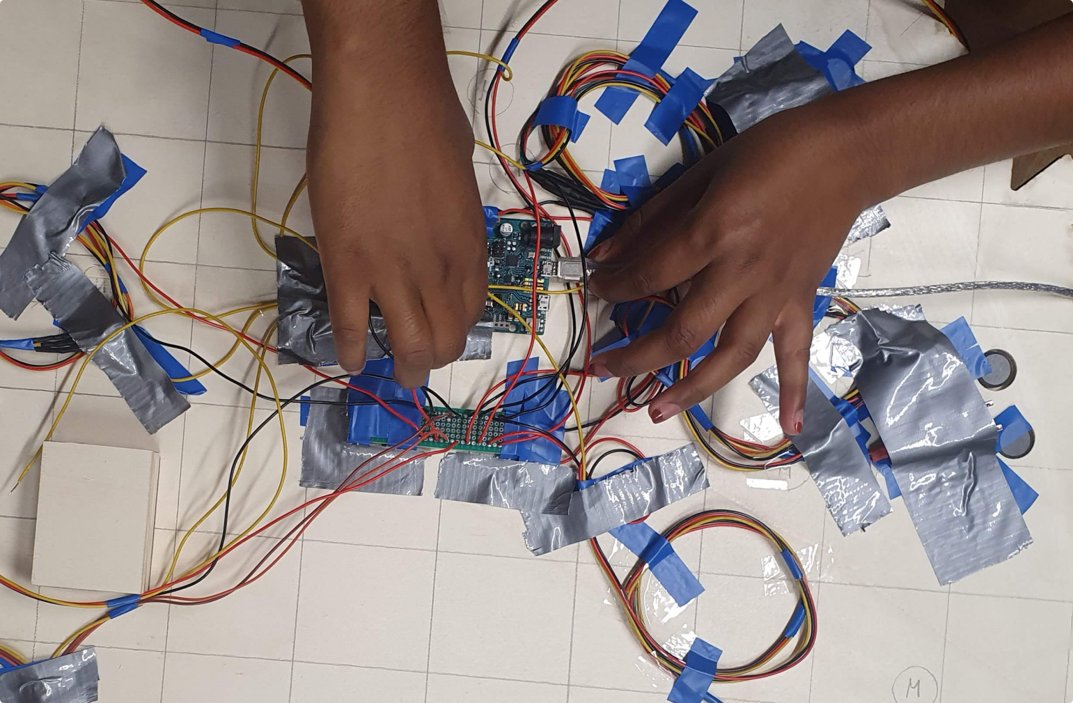
figma, protopie, arduino & premiere pro
my role
project management & coordination ...
user & content research, ideation, conception & development, prototyping, testing, ui design, animation, analog & digital construction
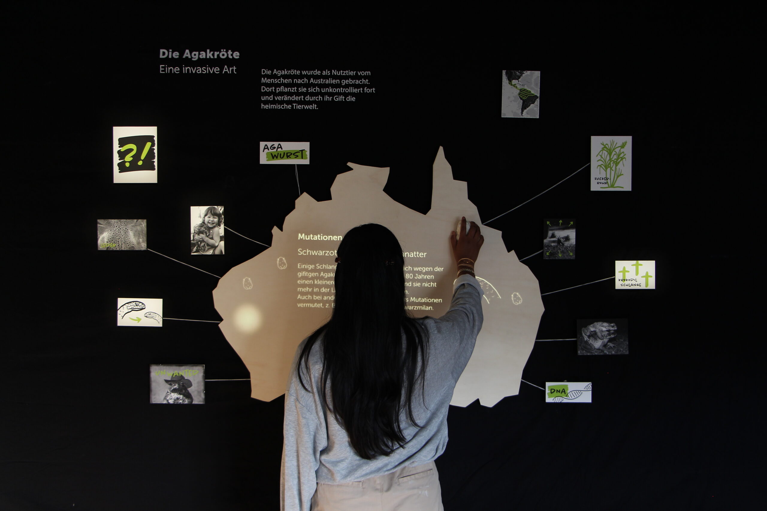
the human use of animals as tools often have
a unpredictable impact on the ecosystem.
insights
complexity of nature
at the extremity of impact in the case of the cane toad, one can well recognize what consequences human interventions can have in the ecosystem and how complex the interdependency of nature is.
multifaceted discussion
It is a discourse that is rich of perspectives and encourages to form an own opinion. Alongside hatred and shock at the problematic effects, positive perspectives and uses are immediately revealed.
human interventions
A discourse emerges about the "godlike" appropriation of humans to intervene in nature, based on the philosophical question of human authorization to act and the related species chauvinism.
animals as tools
the cane toad has been used by humans as a tool, but the fact that it is a living being and that this can have uncontrollable consequences has been overlooked.
process
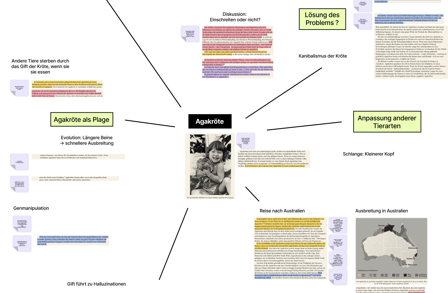
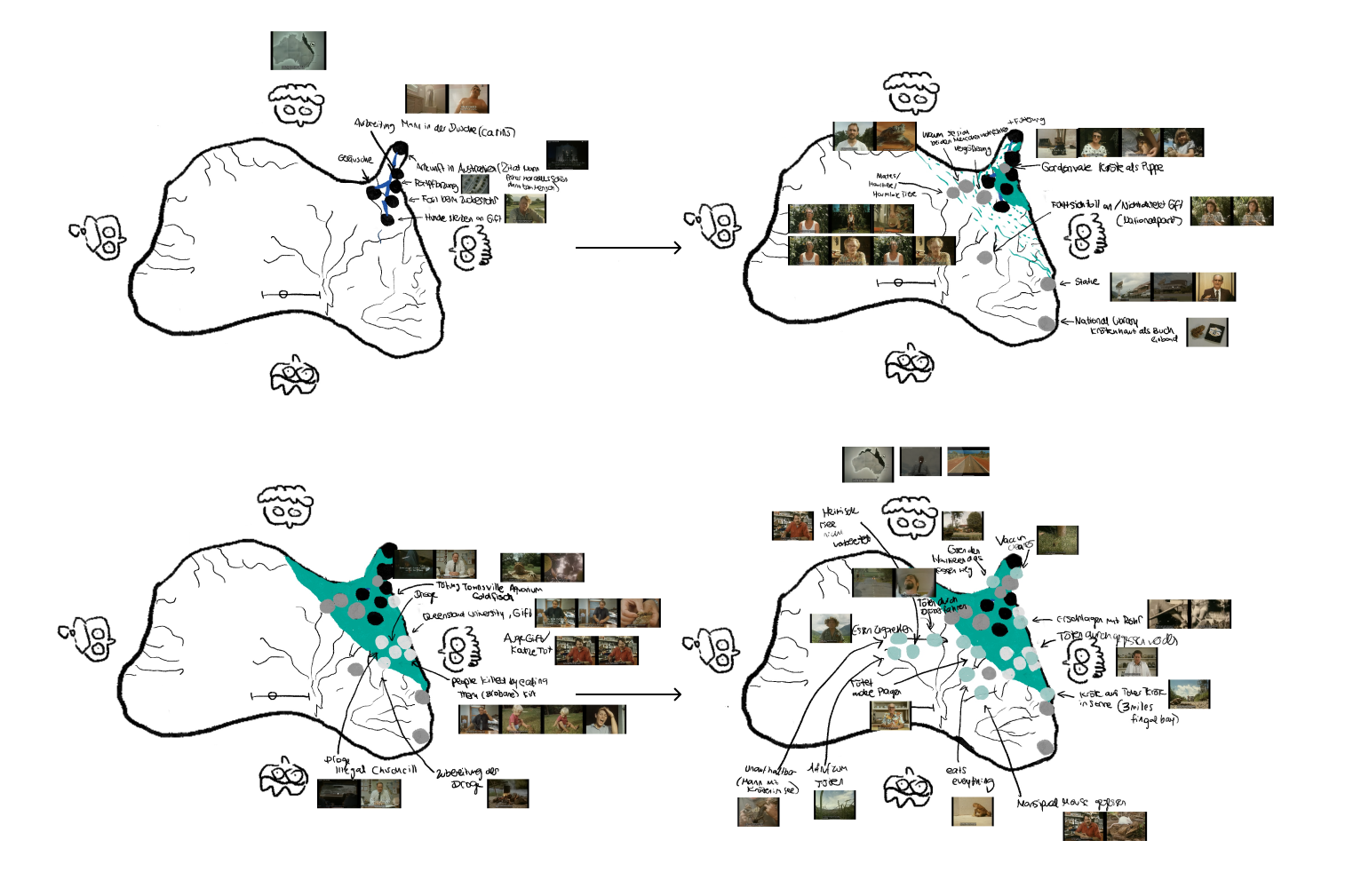
the content is sorted and prioritised into supercategories e.g. in mind maps.
there are the main chapters: journey, impact and solution
important for the impact: to transfer the characteristic chaos of a detective wall into a clear form without losing its charm.
the effects of the chapters that can be controlled with buttons are also assigned there.
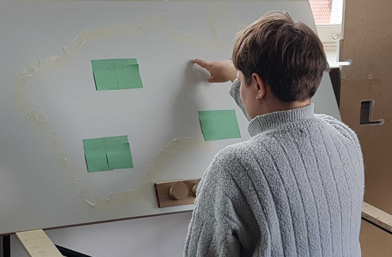
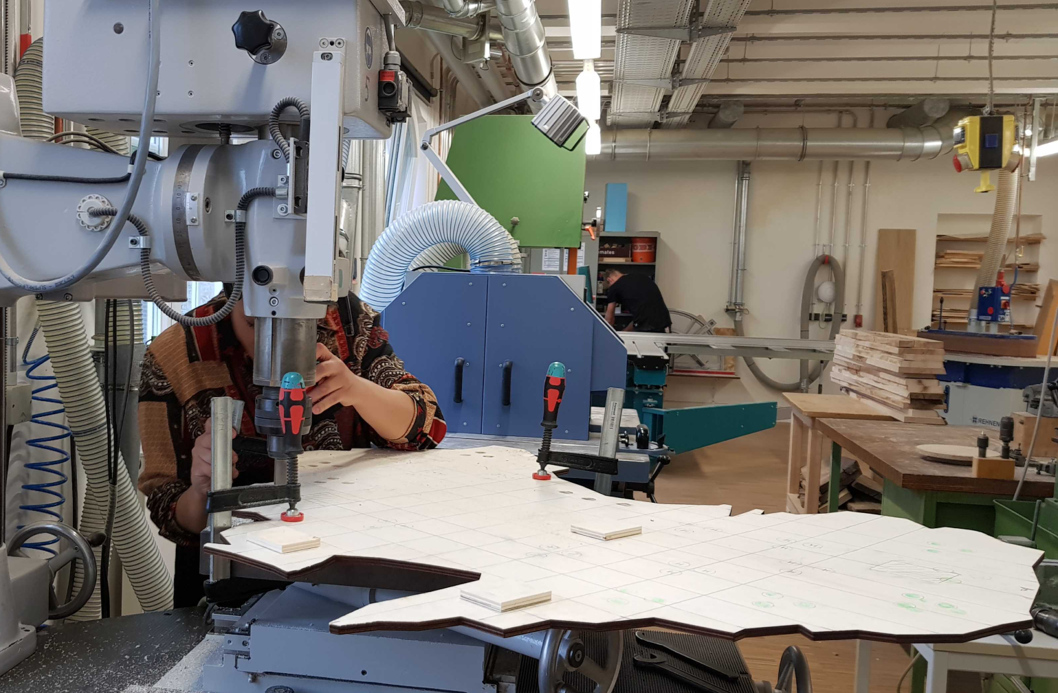
important for the installation: no shadows cast by the visitors and mapping of the content onto the analogue exhibit.
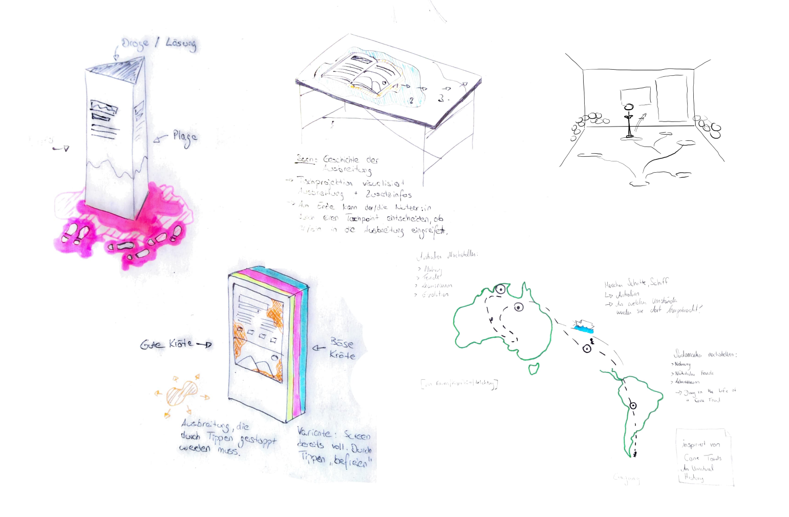
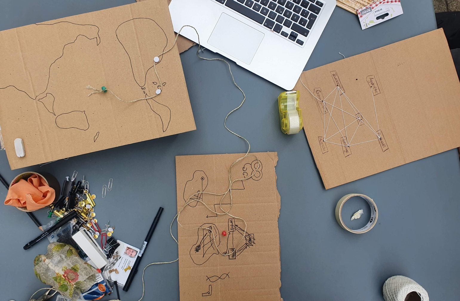
for the diverse visitors to the stuttgart natural history museum who want to learn more about the human impact on the ecosystem,
"cane toad" is a multimedia exhibit that puts them in the role of detectives investigating the circumstances of the accused cane toad, encouraging them to reflect and discuss.
interaction
construction
playful discovery
the users are placed in the playful position of an detective. the progressive discovery of new additional information through personal contribution encourages the interest in digging deeper. this autonomy leads to an intrinsic motivation to learn.
tangible object
the main interactions of the exhibit consist of a 3d printed cane toad being placed on pulsating indicator icons.
independence of content
the contents of the exhibit can also be accessed non-chronologically. there is no strictly defined beginning or end and no reset is required. the aga toad already placed by the predecessor is not disturbing but even an indicator for the interaction possibilities for the next person.
encouraging reflection & discussion
visitors are encouraged to reflect and discuss by being given access to a wide range of perspectives and critical questions that they can answer for themselves.
analogy of the form language
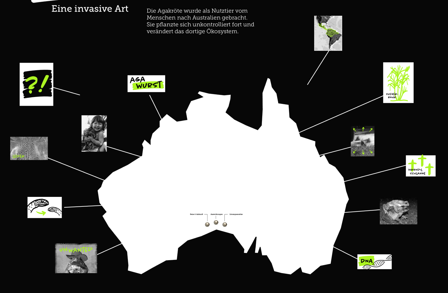
the exhibit is an abstract analogy of a detective wall consisting of a main crime scene and connected pieces of evidence (the tumbnails). the placement of the thumbnails indicates the locations of the events.
the surface of the exhibit allows several visitors to participate at the same time.
synergy between analogue and digital
the analogue level serves as a teaser for users. the exhibit with its various thumbnails tempts visitors to find out more. the digital overlays behind the thumbnails provide deeper insights in the form of short texts, videos and animations.
light as a feedback mechanism
when a chapter is selected, the corresponding thumbnails with their contents are illuminated and the indicator icons for the tangible object appear.
personal growth
technical interest
the project ignited my interest in micro-animations, particularly through using after effects & protopie. i enjoyed exploring the combination of analogue and digital multimedia elements, which expanded my perception of their possibilities. the freedom from guidelines allowed me to focus on selecting media based on their advantages for achieving our goals. this experience highlighted the significance of testing to create intuitive user interactions.
mediation of content & experience creation
I developed a passion about motivation and its psychological aspects, focusing on distilling complex information into engaging, essential content without losing scientific rigor. I enjoy presenting information in a way that is rich in perspectives, encourages autonomous reflection and less dogmatic thinking. My approach involves actively engaging people rather than just having them passively absorb information.